Typography is among the least considered marketing powers. Marketers spend lots of time worrying about color schemes, ad copy, and pictures. But font selection goes a long way for how audience responds and how they trust or don’t trust. It also shows how they will respond when that ad is placed.
Right font strategy not only ensures that content is aesthetically pleasing but also contributes to its conversion potential. It can be measured by leading visitors, and strengthening the brand’s identity.
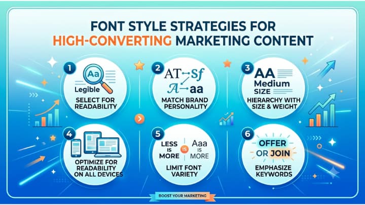
Given below are top five font style strategies.
1. Use a consistent font style throughout the design
Ensure that the font personality matches the brand voice. There are all type style faces that are having an emotional implications.
Whenever the user uses a serif font, such as Georgia or Garamond, you are going to be championing tradition, authority, and trustworthiness. That’s why it is really a great for finance, law or luxury brands.
In the tech and health fields, sans-serif fonts like Inter or Helvetica are popular choices for their modern, clean and inviting appearance.
There is a script and display fonts styles that can add personality and creativity but should only be used to accent, not as body copy fonts.
When selecting a font choose: What does my brand sound like? That should be answered visually before a single word is read in your typography. Depending on the genre of the business, chose the appropriate font.
2. Create a clear typographic hierarchy
Content that has higher conversions is purposeful in directing the eye of the reader. A strong hierarchy requires three levels of text (headline, subheadline, body text), each different in size and weight.
- Headlines should be attention grabbing and take up a large amount of space.
- Subheadings help to divide content into chunks that are easy to scan.
- Body text always comes across as easily readable.
The reader can’t find his way around if there is no hierarchy. With it, they naturally take readers from hook to detail to CTA (call to action), the path that may lead to conversion.
3. Focus on readability and not creativity
There’s a strong desire in using creative fonts, but illegibility will kill conversions in an instant. There is a digital transform Extract Emails from Text, it is best to have body text between 16–18px, and a line height of 1.5 to 1.6 for easier reading.
Please lets there need to selecting the two font styles; one for headings and one for body text to maintain visual harmony but not overwhelm the reader.
Contrast is also of critical importance. In a study of readability, dark text on a light background has shown to be more readable than reversed text, particularly on mobile devices where the majority of marketing content is viewed today.
4. Change the text color and style
Format text using font weight and font size. Bold text is not just a style element, it’s a conversion tool. The judicious placement of weight guides the reader to important words, advantages and calls-to-action.
A CTA button with bold, larger text is going to get more clicks. Such button that sticks out from the text is going to get more clicks.
Variation of sizes also helps to add urgency and emphasis. A price point, a deadline, a key benefit in a larger weight indicates importance and thus doesn’t require additional words.
5. Be consistent on all touch points
Brand identity is broken when typography isn’t consistent, and trust is lost.
A customer will see your brand on a landing page, email campaign or social ad and it should appear consistently each time. Consistency is a sign of professionalism and can help build your brand instant recognition, both of which are silent drivers of conversions.
Conclusion
Typography is not decoration, it’s communication architecture. The fonts you select, their size and their combination with each other either lead the way for your audience to make a choice or subtly push them away.
Use font strategy as a vital component in your marketing arsenal and it will do more work in your content for every word it encounters.