TopHatch presents Concepts, mobile friendly sketching app for creative designers and artists.
Concepts by TopHatch is an advanced, natural sketching and design app for creative professionals. With technology more versatile than ever, we’ve reimagined the design experience to give creators a powerful yet intuitive app that fits the modern designer’s lifestyle. Concepts embraces the future of design by combining the flexibility of adjustable, CAD-like vectors with organic, traditional mediums like pen, pencil, COPIC markers and watercolor, so that creation is natural yet connected. Creative directors, product designers, architects and illustrators use Concepts to explore ideas, iterate on designs, and share meaningful creative work in the moment, wherever they are.
We thanks Erica Christensen, Director of Community at TopHatch, for this exclusive interview.
How was the idea of ‘Concepts’ drawn?
When Ben Merrill (CEO, TopHatch) was a kid, he built robots out of every material he could find. Yet they were never designed well and fell to pieces before he finished them. He turned to sketching his ideas out on paper, but he couldn’t draw them as fast as he could imagine them, and every time he realized how to make a lot better, he had to start over. Pen and paper just couldn’t keep up with his imagination.
His uncle, an architect, showed him CAD aka computer-aided design. Ben understood it was a “future design tool”, but the software was complex, expensive, and required a great deal of training to use. Ben wanted something intuitive and accessible enough anyone could use it – a smarter, friendlier version of pen+paper.
Twenty years later he was back into creative work and the design tools hadn’t improved in cost or efficiency. Frustrated, Ben started dreaming of his own ideal tool, inspired by fictional user interfaces (FUIs) like Jarvis from Iron Man or the command base in Star Wars. When the iPad came out with its new touch-based UI, he knew it was his chance to create what he’d dreamed about – a mobile design tool (so he could design anywhere) responsive to his hands (which echoed his thoughts), with more intelligence than paper.
He built a prototype of the sketching app and teamed up with his partner Dave, an engineer with a PhD in Math who was developing his own creative solutions for iOS. With a steady amount of vision and a mind to create what hadn’t yet been created, they set out to build a better world for designers.
What are your thoughts behind your unique ‘mobile approach’?
Traditionally, design was confined to the desk. The first design software was created 30+ years ago to fit technology that was intelligent then, on giant computers that processed design elements for you and allowed you to visualize in a way you couldn’t before. But the software has become outdated in its approach. We’ve refined our technology, refined our control, developed faster, more versatile applications. Our expectations for creativity and efficiency have risen in like measure – because we can accomplish more, we ought to – and the original tools, while powerful, just don’t keep up.
The freedom to slide your device into a pack or purse and take it with you, and to pull it out when you have a quiet moment and just start sketching – it’s intensely liberating. You don’t have to wait to get home and sit at your desk to start exploring your thoughts. And in this day, we’re connected with colleagues, friends and media wherever we are, so work can happen anywhere. Wouldn’t you rather create and share on your own time, in the moment? You can.
At the same time, our technology is circling back to its natural roots. We appreciate working with our hands instead of being tethered to a mouse. On an artistic level, we can beautifully recreate natural textures digitally. Artists are exploding with creative output like never before, transforming the world daily with unique takes on life, expression, meaning, improvement, process and progress. This freedom is what we want to enable for designers – a way to naturally explore design solutions that improve the world we live in, and not only express those ideas but build on them, to create that better world each of us imagines.
Creativity is explorative, it’s only limited by real world constraints. If we can bridge the energy of the inner self with the life of the outer self via our technology, how much more can we dream, iterate and build our ideas? With the sketching app Concepts, our goal is to enable creative freedom for everyone, to meld the smartest technology with the most powerful capabilities with the most thoughtful human expression, so we can design our future. Everyone has a unique take on how the world should be built – everyone ought to have the ability to explore, iterate and succeed.
Kindly let us know in detail about major features of Concepts.
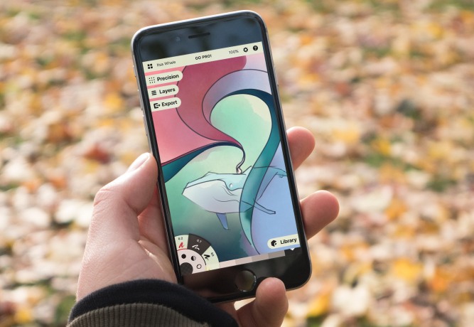
Concepts is a vector-based sketching app that allows creators to explore ideas with movable, free-form strokes, and transform them into precision designs quickly and efficiently. It combines the exactness of CAD with traditional artistic media, something that’s never been done before. Every other design app makes you choose between the adjustable-yet-alien vector or the rich-yet-limited pixel. Our team is developing the cutting edge of what can be accomplished with digital expression, taking a flat, bare mathematical representation that nevertheless has so much potential, and transforming it into a beautiful, fluid, raster-like medium.
Our brushes are modelled from actual pencils, pens, COPIC markers and watercolors so they feel and appear real, but the strokes you draw with these tools are vectors, so anything you sketch, you can pick up and move afterward. You can change their tool type, color, size, scale, position and layer. You can move your ideas around and explore them quite literally on an infinite canvas. You aren’t confined to the size of your paper (unless you choose to be), you can draw and keep drawing until you’re really finished, zooming in or out with crystal clarity no matter how far you go. It’s an open and organic experience, bringing you closer to how your mind truly thinks and iterates on ideas.
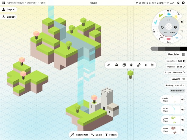
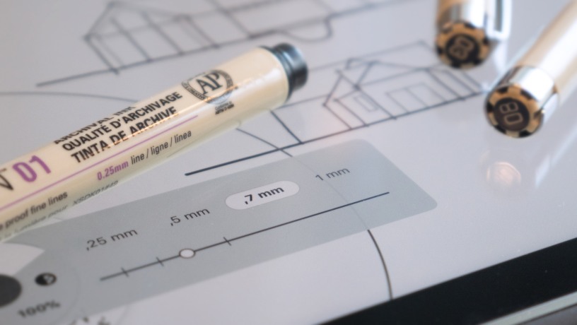
The design and sketching app also helps you to refine that idea into a finished, buildable product. Once you have a foundational sketch, you can perfect it using the precision tools. CAD features such as grid underlayments, snap, measurement, scale, and our flexible shape guides give you complete control over your project. You can import a plan, PDF or reference photo straight onto your canvas to scale, and draw right on top of it in another layer. You can apply scale and measurement to your drawing so that it reflects its real life counterpart. It gives you accurate dimensions so that when you’re ready to build your design, you know exactly how much material you need for each feature.
Concepts’ object libraries are a shortcut to getting things done. Since the objects are vectors, you can drag them straight onto your canvas and change them to any tool, color, size etc. From objects as simple as basic shapes (the building block of any design), to layout perspectives, UI symbols, vehicle forms or fashion mannequins, you can find collections to quicken your workflow. If you prefer to make your own custom objects, you can create those, too, and store them in your own libraries.
We also fully support working with other apps. With iOS 11, you can drag & drop images, text or colors between apps. You can export to many file types, including standard JPG (72+dpi or 150+dpi on iPad Pro) or high-resolution PNG (150+dpi or 300+dpi on iPad Pro), as well as transparent PNGs and PDFs, SVG, DXF and PSD (for use with Adobe’s Creative Cloud). Our high-res exports print sharply on physical mediums of any size, including blueprints, posters and murals.
While the app works well on iPhone and iPad with finger and stylus alike, we’ve really optimized it for iPad Pro users, knowing that the upgraded performance and canvas space really serve professional creators. The Apple Pencil performs seamlessly, it has incredibly low latency with 120Hz ProMotion rendering, and is what our users prefer 7 times out of 10. It feels like a normal (very special) pencil, and makes you forget that it isn’t one.
How have you balanced technical accuracy with creative freedom?
This is the sword’s edge we aim to balance on. We want to provide a design interface where complete creative freedom reigns because the tools are exactly what you need, and they serve you instead of being in your way. No one likes a tool that breaks your creative flow – the best tools are simple, finely tuned to your particular needs, and stay within reach yet out of the way.
As designers ourselves, we recognize that creativity is fluid, and solutions change with constraints and time. To really bring an idea to its best self, one has to not only imagine the solution but adjust it to fit the constraints. It’s a careful, thoughtful process as well as an exciting one. For this reason, we’ve focused on creating an environment where you can fully explore and perfect your designs – where your mind, eyes and hands can trust your experience from beginning to end, so that you can let go and concentrate on the design itself. Our combination of natural sketching tools, adjustable vector-based strokes and precise metrics in the sketching app give you everything you need to take your designs to their full potential on the iPad.
Where does your app fit as a benchmark in the fight between ‘digital’ and ‘pen and paper’?
We respect pen and paper – it’s older than most civilizations, with a texture that science shows connects your working mind and memory to your hands. But there are limitations to paper – you can’t undo, move strokes about, or tweak designs without making a real mess on the paper. Design iterations have traditionally required lengthy copying and redrawing (as many of our architects reminisce, regarding the reams of trace they consumed to get a design right).
There are so many advantages to digital mediums, and with vectors in particular, the possibilities for change mid-work are endless. You can enter a drawing and adjust anything at any time, making iteration and completion so much faster.
This is why Concepts and the iPad are a great fit. The device and interface echo paper, yet you can share your design assets with colleagues immediately, even if you’re across the world. Our development team lives in five countries, yet we’re able to instantly share work, comment in the moment, and get things done.
What were the major technical hurdles you came across during development of Concepts and how did you overcome them?
When the iPad first came out, Ben spent $50K creating the first version of Concepts – all spent on code to develop it alongside the other amazing apps coming out with early versions of iOS. The development community pushed him to build it, promising Field of Dreams’ “If you build it, they will come.” Launch day came and he made a heartbreaking $100. It took that heartache to realize that people weren’t looking for cool apps, they were looking to get things done.
Since then, user feedback motivates every decision our team makes. Every release, almost monthly for five years, we’ve spoken with our users about what they want and come up with solutions that fit their needs. Every morsel of feedback, kindness and money, we place back into our team, process and product, knowing that building our base builds our app. We can develop quickly, update often, and show our community that we’re listening.
Sometimes you hit a place where you can’t go farther without taking a step back and analyzing your own creation. Design has always been about iteration, and our app is no exception. Some of the features our users requested weren’t fitting well into our initial design, so as we developed certain features, we also took the time to consider how to re-imagine the app to allow for these new abilities.
Concepts 5, released in December 2017, is a complete redesign of the app. It has the same core features yet simplifies the experience. It allows for greater customization, more tools, more flexibility. It also gives us the bones to build in many other features our community has requested.
When the first solid build of Concepts 5 was ready, we held our breath and released it to our really amazing group of beta testers for first feedback. We weren’t at all certain what we’d hear back, and our time-expensive development plunge weighed on us. The comments were polar. Some loved the new interface and said it enabled them beyond what they imagined. Others couldn’t stand it – they wanted their old workflows back. So we postponed our release date a full two months to re-incorporate some of the classic elements they relied on to get things done, while enhancing the new interface for the rest.
Good design is truly iterative, and for the type of tool we’re trying to create, we absolutely rely on our users to tell us what they need in order to be successful with their work.
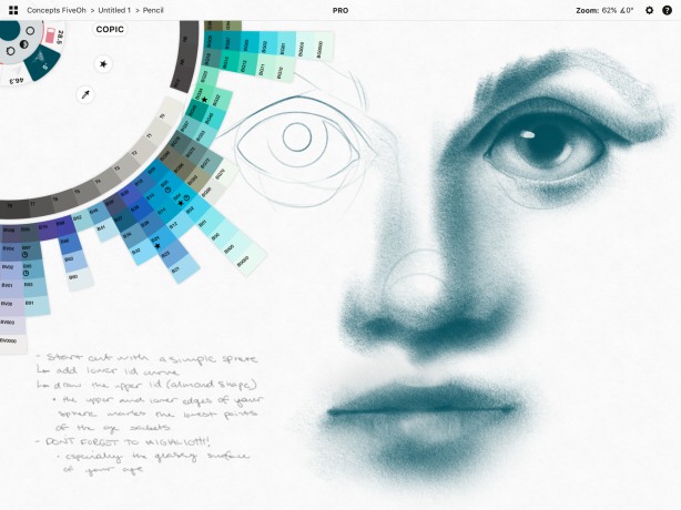
Let us know more about COPIC.
COPIC markers are a popular design and illustration medium created by Too Corporation. The markers and fineliners are a well-loved product, as they are alcohol-based and spread and blend easily, retaining transparency and giving you a polished look with a permanent ink. They have also developed a color wheel with particular saturations and gradients of colors, that allows designers to pick winning color combinations easily. It’s a beautiful wheel that gives beautiful results.
Too Corporation has allowed us to use their color wheel to give designers a digital version of their marker in our app. Our marker “brush” is fashioned with the same texture and transparency as COPIC’s, and our color wheel spins to give you access to the full spectrum with a light drag of your finger on the canvas. You can also create and mix special color palettes (similar to the collections COPIC creates for landscapes, portraits etc), so you can access the colors unique to your project without having to search for a particular color every time you need it.
Please explain the different versions and pricing policies of Concepts.
We believe everyone is a creator and deserves a solid sketching app, whether they can afford one or not. Our basic version of Concepts is free to download and gives everyone access to all of the sketching tools, the infinite canvas, five layers and basic exports. Every user can create a free Concepts account to sync their palettes and preferences between devices.
Professionals can upgrade to the Essentials, a full set of design tools that opens up the power of vector sketching. It also gives you the Basic Shapes object library (our most versatile and popular library), and high-resolution exports (PNG, SVG, DXF, PSD, and native CPT) so you can bridge other apps within your area of expertise, share them with colleagues, or print your files into physical formats.
Users can always add features to their app experience with a-la-carte purchasing, as well. Niche features like object libraries or our specialized PDF markup ability can give them additional functionality, depending on their personal needs.
Our subscription option gives creators access to every feature and library in sketching app, with an added bonus for teams, allowing designers to share assets live with each other. We’ve aimed to keep subscription very low cost compared to other professional design software, allowing us to continue to develop future features while giving professionals the ultimate in powerful design capability.
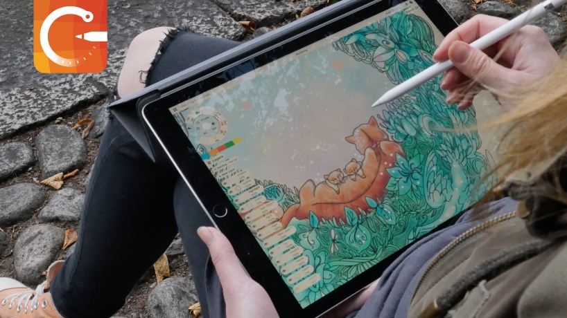
What have been the major credentials of Concepts so far?
Our happiest credentials are the success stories our community shares of how the app changes their lives for the better. We are thrilled to hear the difference it makes in our designers’ day-to-day lives.
- Architect Craig Burns has gone completely paperless in his company
- Erick Mikiten designs dream homes with clients
- Evan Bronstein teaches his rising architectural students about design using the app
- St Cyres School in Wales uses our classroom edition to teach their product design and art courses to their students
- Bart Massee, Creative Director at HP, delivers vision to his design team daily
- Movie director Yarrow Cheney illustrates storyboards to create and direct award-winning movies
- Business owners like Marko Hamel from Visual Selling have built their entire company workflows around the app
We’ve also appreciated Apple’s recognition as Best of 2013 in the US and Best of 2016 in China and other parts of the world, as well as our inclusion as a demo app on the iPad Pro in Apple Stores. It encourages us to believe that we’re working to accomplish the same ideal – to allow designers of all ages to create their ideas anywhere, everywhere.
What does Concepts have in store for us in future upgrades?
We have a lengthy list of features we’re excited to be working on for the sketching app. We’re expanding the toolset, our precision capabilities, and our integration with other apps. We recognize that we’re young compared with desktop applications, and we’d like to enable more features – both vector and raster rich – so that creators can have a full working relationship with their mobile device.
Our goal is to give designers as much control over their creativity as possible, no matter where they’ve come from or where they are in the moment. With the right tools and a flexible, determined mindset, anyone can build their vision.
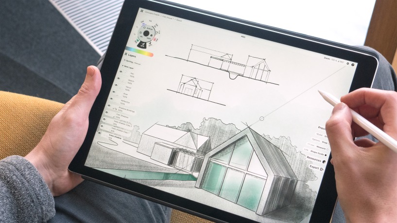
Thanks again Erica Christensen for providing such in-depth information regarding Concepts, the best sketching app. We wish entire team of TopHatch a grand success ahead, to achieve more milestones and in turn, assist every creative artist and designer to accurately portray their vision into reality through help of Concepts.
Check out useful links:
https://cnce.pt/go (App Store)
https://concepts.tophatch.com/ (Website)